Pantone's colour of the year 2020
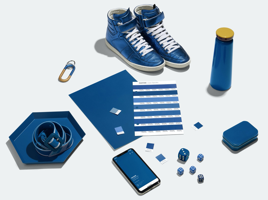
Since it’s inception in 2000, Pantone’s colour of the year is widely seen as a momentous announcement in the world of design. And so, the American colour company has announced 2020’s defining shade as Pantone 19-4052 Classic Blue. The colour is described as "a reassuring presence instilling calm, confidence and connection"
The choice is a reaction to the fast-moving world around us, according to the company. “As technology continues to race ahead of the human ability to process it all, it is easy to understand why we gravitate to colours that are honest and offer the promise of protection,” Pantone says. The shade is also a nod to wider trends in the design world and society. “Genderless in outlook and seasonless in endurance. Emblematic of heritage but at the same time highly contemporary”.
“We are living in a time that requires trust and faith,” says Leatrice Eiseman, executive director of Pantone. “It is this kind of constancy and confidence that is expressed by Pantone 19-4052 Classic Blue, a solid and dependable blue hue we can always rely on.”

Taking this into account, this is the first year that Pantone has collaborated with ‘sensory experts’ to take the shade beyond a colour swatch. “Classic Blue takes on distinct appearances through application to different materials, finishes and textures from shimmering metallics, lustrous sheens and high-tech materials”. The company has worked with creatives from the fields of music, food, fashion, beauty and technology to imagine Classic Blue as “a sound, a smell, a taste, and a feeling”.